Build a strong brand through simplicity
Simplicity inspires greater trust and deeper loyalty in customers.
Keeping things simple and focusing on what is essential are often the best way to express more complex concepts. Simplifying means travelling more lightly, getting to the destination without being confused, and finding what we are looking for.
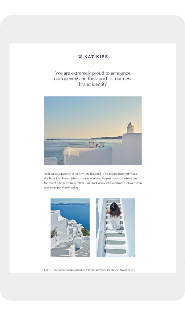
What makes a brand simple? Remarkably clear and fresh experiences. The internationally renowned Katikies Hotels & Resorts worked with Positioner to develop and launch a new and unique brand presence. Our vision was to give Katikies a new voice and identity, shifting attention to the brand and the hotels.
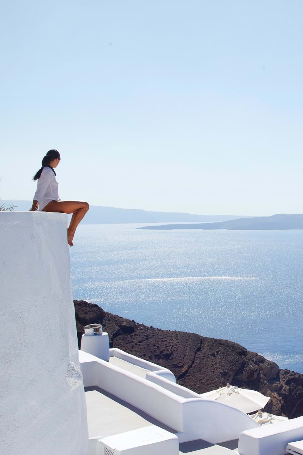
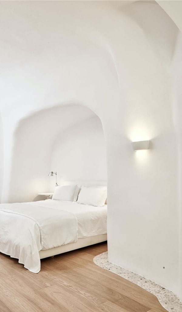
The aim was to make Katikies a destination in itself, decoupling it from its legendary locations and making each hotel a dream destination in its own right. We wanted to simplify the virtual journey and make it immediately accessible and visible. Simplicity and symmetry are a major feature of the hotels and Cycladic architecture, so we opted for evocative and immersive photos, a simple graphic layout and content that describes the essential attributes of each hotel and destination, using uncomplicated language and graceful wording.
Process
The process was developed carefully and methodically, starting with developing an understanding of the brand and analysing its definition and characteristics, before applying its core values to all the touch points.
Brand values
Katikies provides emotions and memories that remain vivid long after the holiday ends, and its exclusive world is a tribute to the beauty of nature and humanity’s ability to bring out its full potential. Despite its reputation, the brand’s online presence did not reflect the brand values nor the distinctive experience guests enjoy at the hotels. Each of the hotels is different, although they all maintain a very strong sense of belonging. The brand values are clear in the hotels, places and services offered and demanded more emphasis in the new communication.
How did we redefine the essence of the brand? We promoted the primordial connection with the location (Greece) and increased the sense of the properties belonging to a single brand, with a well-defined and well-rooted vision and values, but at the same time highlighted the uniqueness of each hotel, positioned with its target audience in mind.
Brand identity
The new brand identity has been transferred into the global communication, a new tone of voice has been adapted, the hotel naming has been adapted, the logos have been restyled and the content and picture language have been analysed and optimised. The communication style needed to be the same throughout, derived from the brand values, and the general online experience has been transformed into a platform that improves the sense of belonging and provides an exceptional customer experience.
Today’s brand positioning requires a different approach from traditional methods. It has to encompass far more and relate to customers on many levels. Every single aspect of the brand identity has to be analysed and optimised to ensure a strong and complete virtual and real customer experience.
The rebranding concept has been applied to all the various hotel communication materials. Coordinating the materials strengthens the brand identity, in line with the positioning undertaken.
The aim is to present a coherent and coordinated communication and promotional language that respects the brand’s new graphic and conceptual aspects.
Website
When developing the new approach, each part of the site was studied for a specific purpose, from a functional and messaging point of view. The domain architecture was completely revised to resolve inconsistency across the different properties, which created confusion, unfriendly user behaviours, weak SEO rankings and user experience issues.
The website redesign process was based on the idea of restoring strength and importance to the visual and evocative part of the brand, making the flow of information more fluid, clear and concise. The layout has therefore been kept simple and clean, never burdened by distracting external graphic elements. Our process guided us towards a strong formal and structural cleanliness, which recalls the original beauty of the structures and locations. The online experience connects emotionally with the audience and expresses the brand values. Great importance has been given to the narrative and emotional use of the images: a feeling of going on a journey to discover the hotel has been sought on each page. The actions / call to actions are present and always visible, but, like all the communication, they are very subtle, ensuring the true essence of the place is expressed.
Digital marketing
Rebranding involves considering the communication strategy in its entirety, and thus implies making changes to the digital marketing communication and the corresponding actions. Strategies still pursue specific objectives, but they have been integrated by modifying the language and content of the messages, including images, logos and words or slogans. Their presence on all digital platforms and sales channels has been also reviewed.
Social media is a fully integrated part of the brand's communication tools. The current positioning and presentation of social profiles, their communication and the type of language and content published therefore had to be reconsidered. Logos, images, videos and content were revisited in a new style, coordinated with the brand’s central image. Interactions were also analysed to further strengthen virtual communication with followers and recreate the empathy found in the brand’s hotel service.